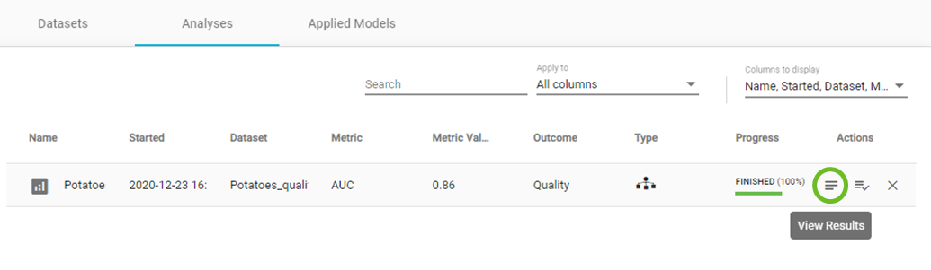
Viewing Analysis Results
When your analysis is complete, under the Actions column, click on 'View Results' icon.
View results
Within the Analysis results main window, you will have several layers of information:
- ANALYIS ACTIONS sidebar.
- PROJECT DETAILS sidebar.
- Analysis name.
- A link to share your results.
- an Overview of the analysis process.
- Performance overview, feature selection and analysis visualization results.
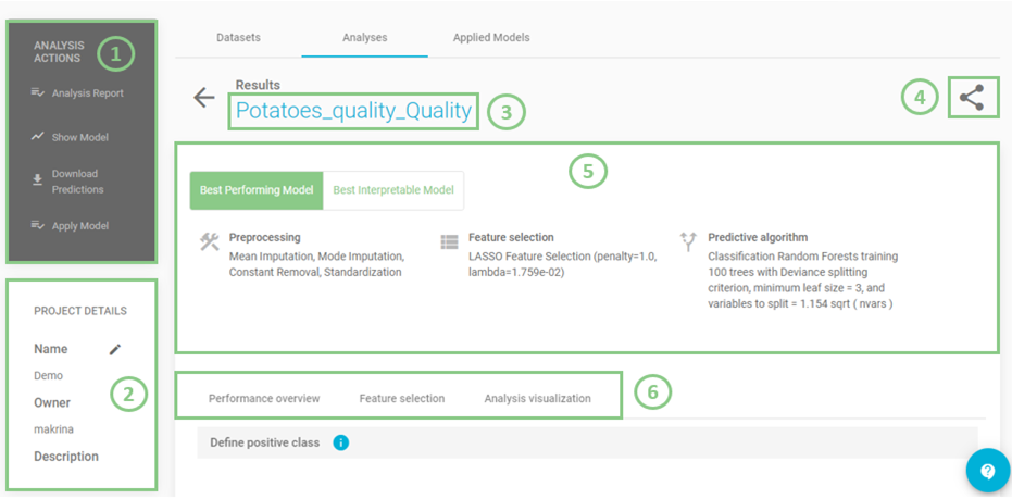
Analysis results main window
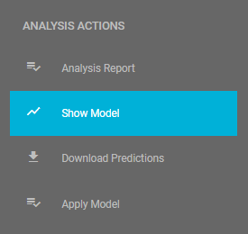
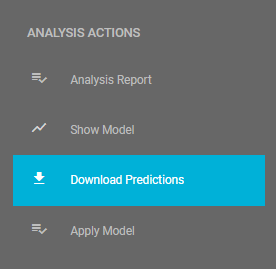
In the ANALYSIS ACTIONS sidebar, JADBio provides options to:
- Summarize the analysis (as an Analysis Report).
- Show Model (if it is an interpretable one).
- Download Predictions of the samples.
- Apply Model to new samples.
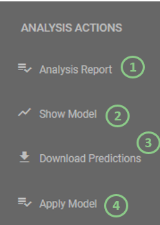
Analysis options
- Click on 'Analysis Report'.
Here, JADBio provides a summary audit of the analysis including: Dataset, Outcome to Predict, Analysis Type, etc. and a description of the selected options as well as the JADBio version.
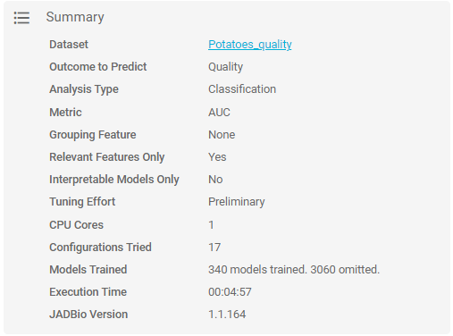
Analysis summary
JADBio also presents a list of all of the configurations that were tested in order to produce the model and selected features.
Note
A configuration is a combination of preprocessing steps, feature selection algorithm and predictive algorithm that were tested during the analysis.
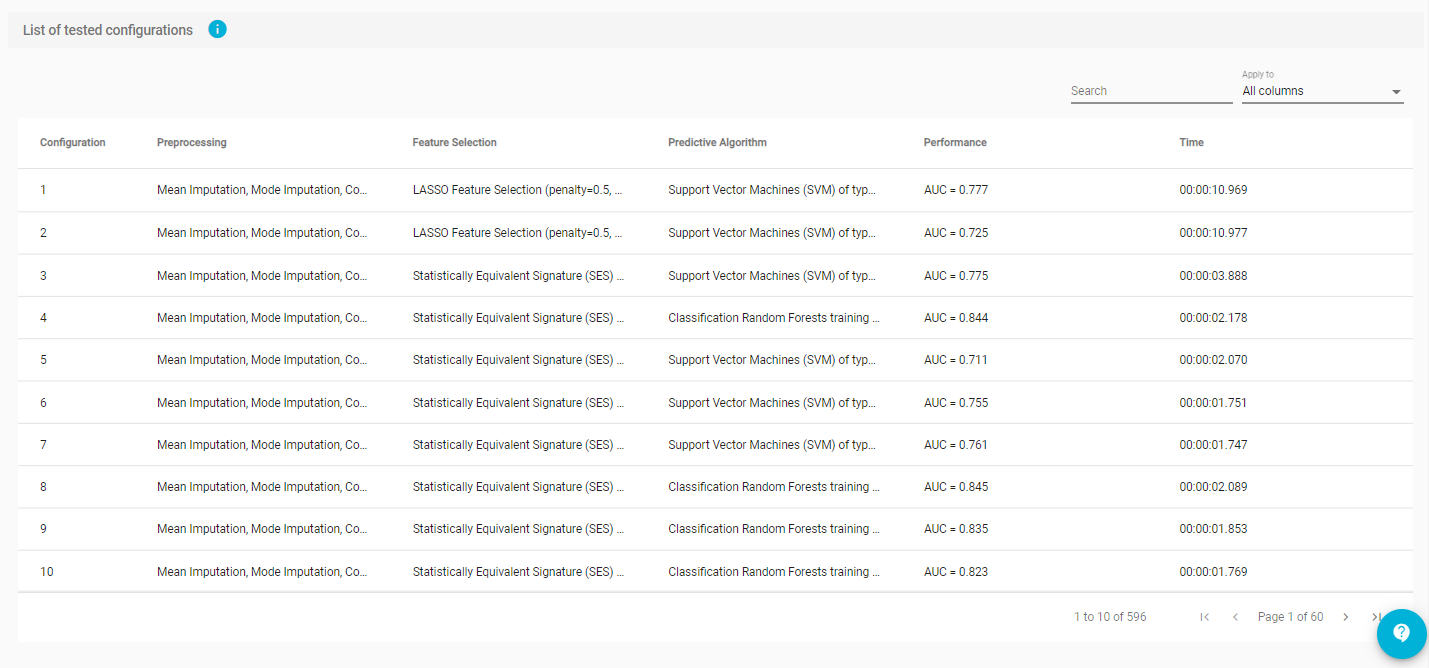
List of configurations tested
- Click on return button to return to the main analysis results page.
Best model configurations
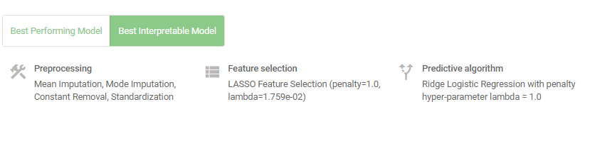
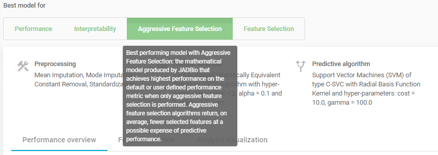
The Analysis page provides an overview of the analysis process and a description of the Best Performing model and the Best interpretable Model.
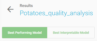
Note
During the configuration of the model search in analysis set up, if you don’t force JADBio to only consider interpretable models as the Best Performing Model, then JADBio might provide two models, a Best Performing Model and a Best Interpretable Model.
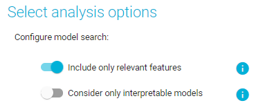
Configure model search
Interpretation of best configurations
The Best Performing model is the mathematical model produced by JADBio that achieves highest performance on the defined metric.
The methods include the optimal configurations for: Preprocessing, Feature selection, and Predictive algorithm.
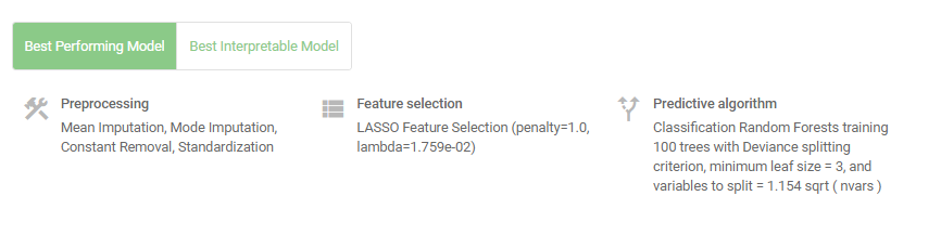
Best Performing model
Visualizing interpretable models
- Click on 'Best Interpretable Model' button.
Best Interpretable model
The Best Interpretable model is the mathematical model produced by JADBio that achieves highest performance among all interpretable models tested (e.g., Linear or logistic regression models, decision trees).
The Best Interpretable model may or may not coincide with the Best Performing model.
- Click on the 'Show Model' in ANALYSIS ACTIONS sidebar.
Visualize model
Here, JADBio displays the features and the intercept that provide the most accurate prediction of your outcome e.g., the prediction of potatoes quality.
- Hover over the features bar to visualize the values for the optimized Ridge Logistic Regression model.
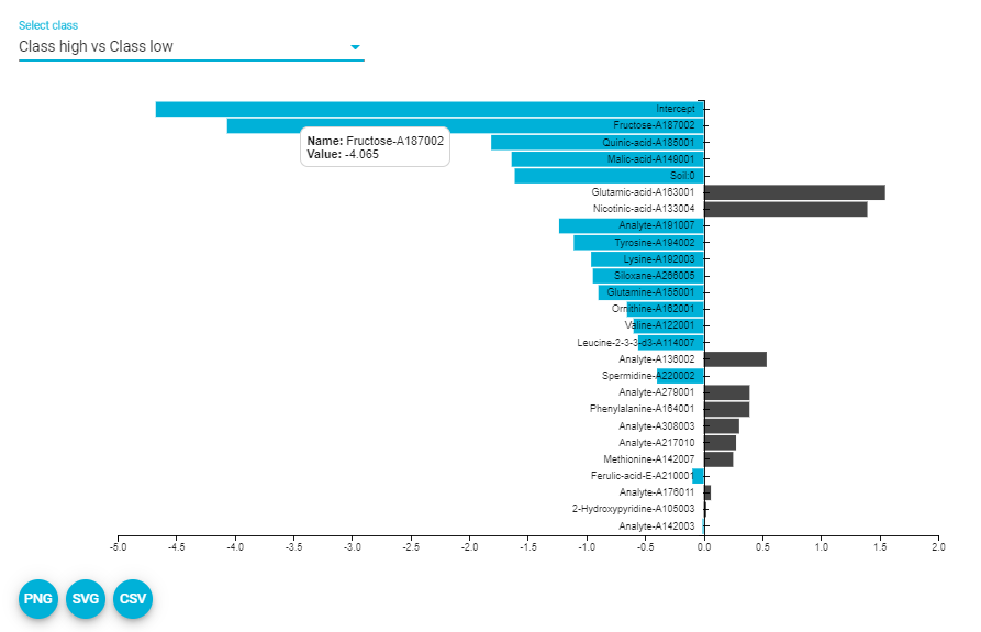
Show model (downloaded SVG)
The numbers provided describe the relative strength of the predictors based on the logistic model. The larger the absolute value of the feature’s value in the model, the greater the impact that feature has in the prediction of the outcome.
Note
It is possible to download both the image and the numbers supporting the image from the 'PNG', 'SVG', 'CSV' buttons.
Reviewing the performance
Selecting a class (refer to multiclass problem as well)
Reference class is considered the class of Positive samples and the rest are considered Negative ones. For this example, let’s consider "high” as the positive class.
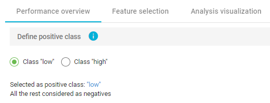
Define positive class
Performance metrics that are independent of the chosen threshold (ROC & PR)
The performance of the binary classifier (low or high quality) can be described by the Area Under the Curve (AUC) of the ROC curve and by Average Precision of the Precision-Recall curve.
A Receiver Operating Characteristic curve (or ROC curve) summarizes the trade-off between the true positive rate (sensitivity) (Y-axis) and the false positive rate (1-specificity) (X-axis) for different probability thresholds. The best ROC curves are the ones where X (false positive rate) = 0 and Y (true positive rate) = 1.
A precision-recall curve (or PR Curve) is a plot of the precision (Y-axis) and the recall (X-axis) for different probability thresholds. The best PR curves are the ones where X (recall) = 1 and Y (precision) = 1.
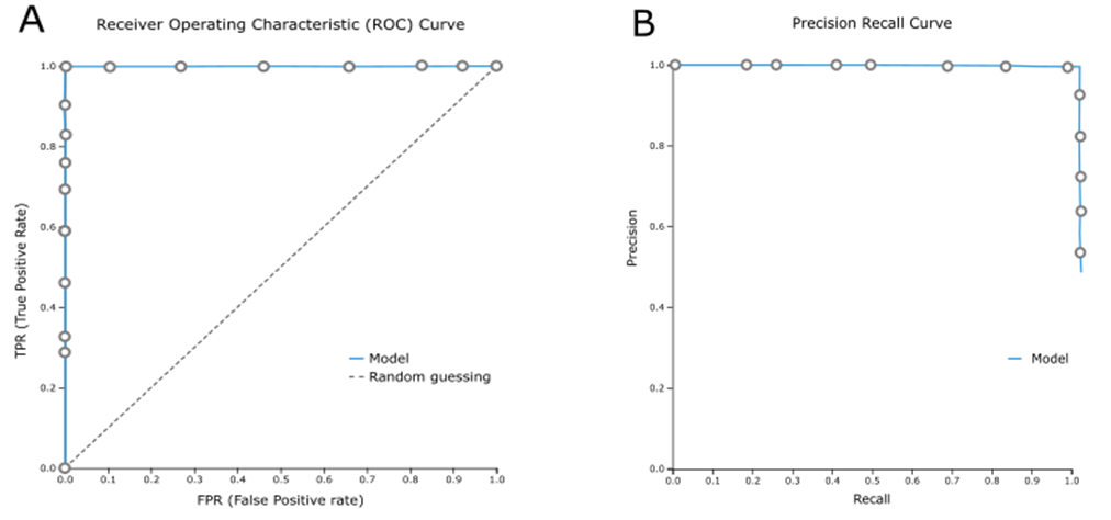
A) A perfect ROC curve, B) A perfect PR curve
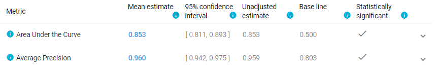
Area Under the Curve and Average Precision metrics for the Best Interpretable model
Info
ROC curves are appropriate when the observations are balanced between each class, whereas precision-recall curves are appropriate for imbalanced datasets.
- Click on icon to view the distribution of each metric.
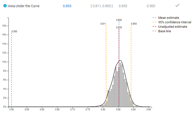
Distribution of AUC metric
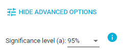
Note
In  button, JADBio allows you to choose between three values of significance levels.
JADBio allows you to optimize the classification threshold for a gradient of metrics for optimal specificity to optimal sensitivity.
- Optimize classification threshold for Matthews Correlation Coefficient (MCC), and note the selection of the position on the ROC curve.
- Hover over the highlighted ROC curve to see the full range of metrics at this threshold.
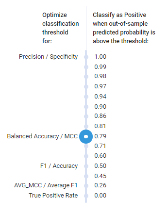
Optimization thresholds
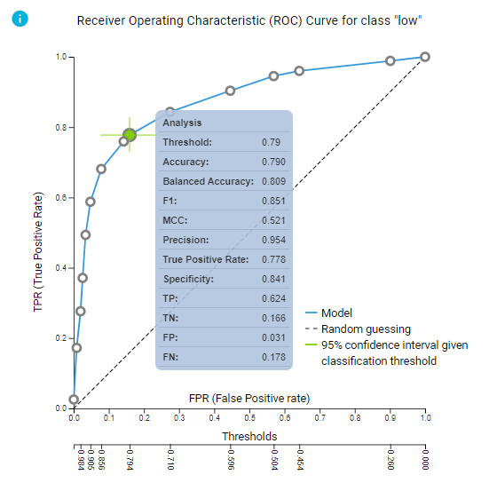
ROC curve and predictive performance for the selected threshold
- Click on the 'ROC plot - Precision recall plot' button to view the Precision recall plot.
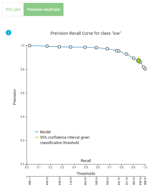
Precision Recall plot
Confusion matrix
Confusion matrix is a table that describes the performance of a classification model (or "classifier") on predicted class (values) for which the true class (values) is known. In JADBio, confusion matrix displays the percentages of the predicted values vs the real true values.
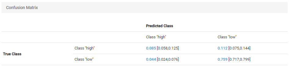
Confusion matrix for the selected threshold
Performance metrics that depend on the chosen threshold
Here, JADBio reports several different performance metrics and their confidence intervals based on your Best Performing Model.
- Hover over any adjacent to a metric for an explanation of the score.
How you set the thresholds will be determine the overall sensitivity and specificity of the model.
Note
As you move your cursor in the JADBio windows, JADBio will provide contextual information or links to relevant locations within the application.
Feature selection results
Feature Selection is a process that identifies a minimal-size subset of features that is maximally predictive of the outcome of interest, the selected target feature.
- Scroll back to the top of the page, and Select the Feature Selection tab.

Feature Selection tab
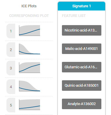
Signature
A signature is a minimal subset of predictive features that, when considered jointly, are maximally informative for an outcome of interest. As a product of each analysis, JADBio produces all signatures that perform equally well, up to the maximum limit defined in parameters. In this example, JADBio produced 1 signature of 25 features regarding the Best Interpretable Model.
Part of the selected signature
Signature equivalence
Ideally, one would like to report all signatures that lead to optimal models (up to statistical equivalence) so as not to mislead the clinician or the biologist and provide choices to the designer of diagnostic assays. This is the multiple feature selection problem, as it is called. JADBio is unique in that is incorporates proprietory algorithms that efficiently solve the multiple feature selection problem. You can view the best model using such algorithms by accessing the Aggressive Feature Selection tab.
Aggressive feature selection tab
ICE plots
The Individual Conditional Expectation (ICE) plots further reveal the nature of the contribution of each metabolite feature to the model.
- Click on the thumbprint ICE plot adjacent to the features to enlarge the ICE plot.
- Use the pulldown to select another class.
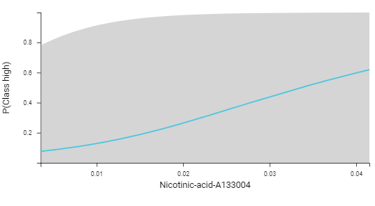
ICE plot
Feature importance plots
The practical use of Feature Importance plots is evident in the case of selecting biomarkers. For instance, the purpose of this analysis is to identify the optimal list of biomarkers that predict potato quality. However, in order to satisfy economical or technical constraints on an assay, JADBio also reports the cost to performance that occurs when one chooses to further reduce the total number of predictive biomarkers from those included in the Best Performing Model. In this way, you, can evaluate the trade-off between reducing the number of biomarkers and achieving optimal performance.
Both in the Progressive Feature Inclusion plot and in the Feature Importance plot, JADBio displays the features of the selected signature and their relative performance.

Feature importance plot reports feature importance defined as the percentage drop in predictive performance when the feature is removed from the model. Grey lines indicate 95% confidence intervals.
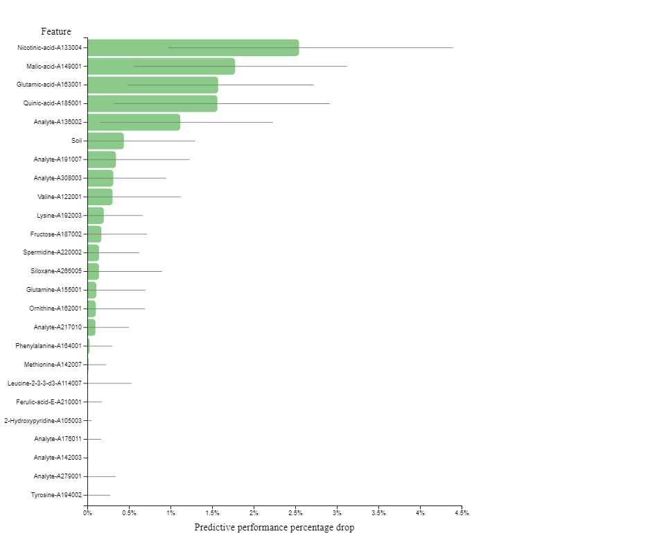
Feature Importance plot
Progressive feature inclusion plot reports the predictive performance (in percentage) that can be achieved by using only part of the features. The features are added one at the time, starting from the most important and ending with the complete signature. Grey lines indicate 95% confidence intervals
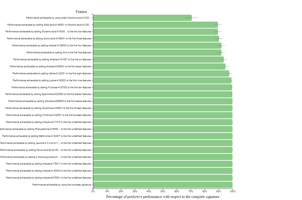
Progressive feature inclusion plot
Analysis visualization
- Select the Analysis Visualization tab.
Dimensionality reduction plots (supervised UMAP / PCA)
Uniform Manifold Approximation and Projection (UMAP) attempts to learn the high-dimensional manifold on which the original data lays, and then map it down to two dimensions. UMAP plots provides a visual aid for assessing relationships among samples.
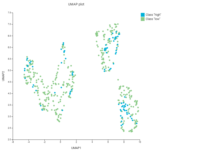
UMAP plot
Principal Component Analysis (PCA) is a dimensionality reduction technique that seeks the linear combinations (principal components) of the original features such that the derived features capture maximal variance. JADBio performs dimensionality reduction on a subset of the original dataset, keeping only the features included in the first signature.
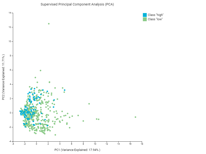
Supervised PCA plot
Class probabilities plots (density / box)
Both Density Plot and Box Plot contrast the cross-validated predicted probability of belonging to a specific class against the actual class of the samples.
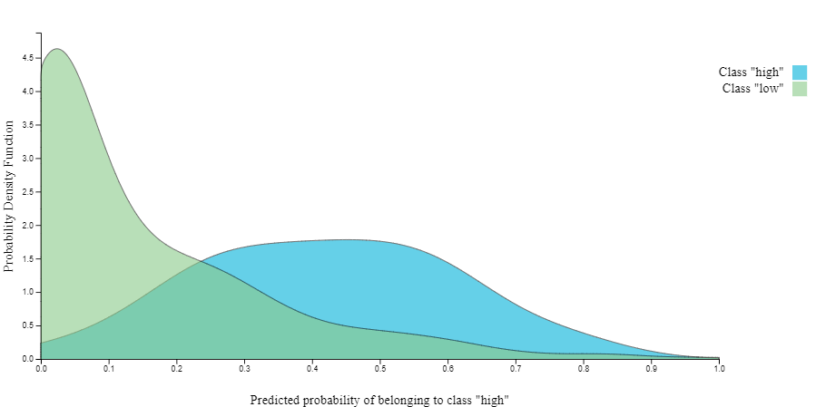
Probabilities Density plot
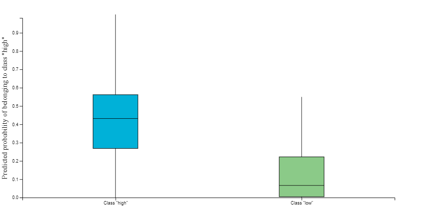
Probabilities Box plot
Download model predictions
- Under ANALYSIS ACTIONS Click on the 'Download Predictions' button.
Download predictions
In the downloaded analysis_predictions.txt, you will see each of the analyzed samples and, based on the cross validation of the best configuration,
their relative difficulty of prediction. For each sample you will see the probability the sample would be predicted in each class e.g.,
low or high quality. The Label column is the actual values from the dataset.
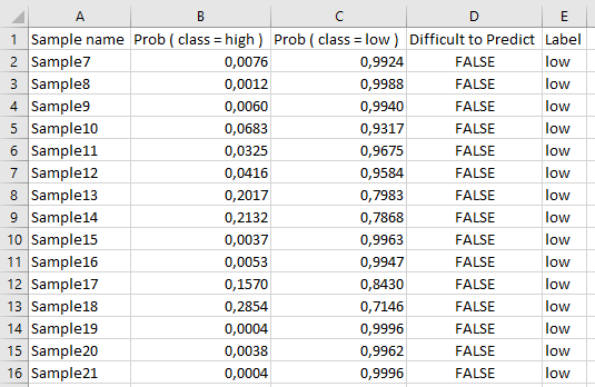
Downloaded predictions viewed in spreadsheet
Sharing your results with the world
On the top of the analysis results page there is a dedicated share button for creating a sharable link to your results. To do so:
- Click on the share button .
- Click 'Create link' on the pop-up window.
- Click 'Copy link' when the link is created.
- Paste the link on the address bar of your favorite browser too see the same results page but platform-independent.
Note of appreciation to JADBio users
We constantly make changes in the software and do our best to update these materials, but you may notice some differences. We welcome your feedback on how to make this more useful for you and requests for future tutorials.